Sound Wave by Jean Shin

Razafindrabe Aritia Class D
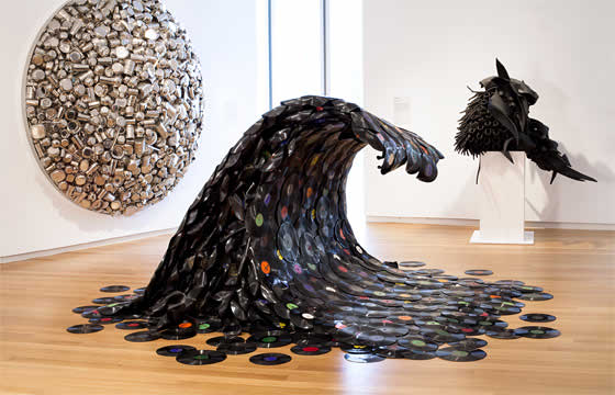
Sound Wave

Sound Wave (5.2 ft h x 12 ft w x 12 ft, 2007) by Jean Shin is an Artwork realized by melting 78 rpm records on a wooden armature. Records were melted and sculpted to form a cascading wave, dotted with bursts of colorful labels. This cascading wave could be link with The Great Wave by Hokusai which depict an enormous wave threatening boats of the coast.

Although in this case, we could guess that what it is shown is a concrete representation of what we can’t see, it is as to say the sound wave emanating from what we hear, in particular from the music we are listening. The multiplicity suggest the idea that we are submerge by the music that’s surrounding us, the music of our everyday life.

The fact that the artist use record, an object who have been forgotten since the creation of cds or mp3 players, highlight the evolutions of society, the evolution of technologies who come to end the reign of a consummation’s object who become eventually obsolete and the ephemerality of both music and our music taste. It’s a kind of tribute to the forgotten records who keep a part of human kind’s memory.

This sculpture is pretty inpresive for two reasons: irst the media used, it was kind of refreshing to see something different and at the same tie which were a part of our daily life. Secondly the concept of concretizing something abstract which is invisible to the eyes is really impressing, for it has always been a question that some artist are still trying to solve. Moreover, although the use of records is unusual, it may be too literal by representing a wave of objects that emanate sounds.
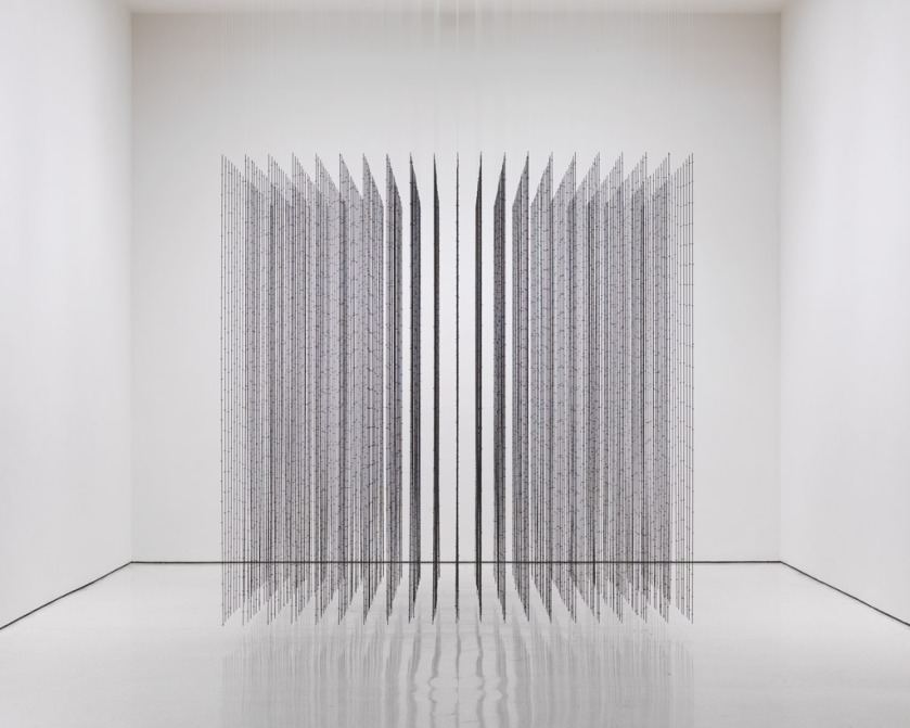
Impenetrable, Mona Hatoum

Impenetrable, 2009, barbwire and fishing line, 300 x 300 x 300 cm. This work of art is a cube made hundreds of barbwire put together very geometrically, levitating above the ground. A very light however aggressive work. I immediately thought of the work of one of my favorite artists when I saw this work: penetrable works of Jesus Rafael Sotto, who plays with the participation of the viewer in the work (the observer can be part of the work). And Mona Hatoum makes this time a work of art in opposition with Sotto’s work; she plays with violent materials such as iron and barbwire and then can to play on words with the title Impenetrable, which is a paradox with the work of Sotto that invites the viewer. Here, Mona Hatoum reject him.


Mathilde MOREL, Dhatoum_install_view-1024

François Morellet- Géometree n°109


morellet.jpg


This is a work of art from François Morellet, it title is “geometree n°109”. It was realized in 1993. He makes a word game between geometrics and tree. This painting is composed to a tree branch which takes a form in right angle. This tree branch seems to have Y form bisection. Plus Morellet uses only vertical lines, horizontal lines and diagonal lines in black on a white background.  With these tools, he forms a square which comes with in full in de work of art; two sides in black painting and two others sides with a tree branch. Then have a slightly inclined square comes out of the painting, it’s composed with two diagonal lines black and the Y form bisection.  This artwork measured 240 x 240cm. “Geometree n°109” belongs to Musée des Abattoirs since 1995.

With the word game, he makes a surprising connection between nature that grows everywhere which no rigor and geometry which highly structured. Morellet is a mixture of order and disorder. It is an association between nature and artifice. Usually it’s the geometry that brings rigor, structure whereas here it’s nature that comes to structure the painting.

Morellet establishes differents forms of arrangement (overlapping, fragmentation, juxtaposition, interference…) can define his work as experiments. Thereafter he worked with neons.

Garcia Julie D

Berndnaut Smilde, The artist who makes clouds…

NIMBUS

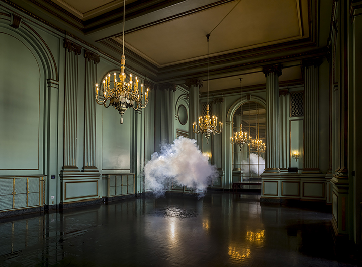
The Dutch artist is known for his “Nimbus” series, in which he creates perfect, fluffy clouds in unique indoor spaces: churches, castles, dungeons, and most recently, in honor of Frieze New York, NeueHouse on 25th Street. The only lasting memory of his series is singular photograph the perfect picture of the cloud in that space which Smilde and his team work to capture.

To create a cloud, it involves a very humid room, a smoke machine, and lots of mist coming out of a spray bottlee.

Smilde has been doing his “Nimbus” series for several years now, across the globe London, Germany, the Netherlands, and now, New York, just to name a few. He told us the idea came to him when, after working with installations and sculptures, he “wanted to make an image of total disappointment. Like there was nothing to see in the space it was just a cloud. Plus, he loved the duality of bringing something outdoor, indoor, as well as the duality of clouds themselves. “They can, for example, stand for the divine but also for something threatening or misfortunate,” he said. “Clouds are something really universal. Something that people give meaning to.”

“It’s true it was hard not to play the “that looks like . . .” game with each shape that appeared in the humid gallery”, said Berdnaudt. He really wants people to project their own ideas onto their work.


Mathilde Herrmann, classe A

La grenouillère by Jean Fautrier

I chose to present a painting of Jean Fautrier which is called «  la Grenouillère ». This painting comes from the informal art. The movement appeared at the end of the second world war and has been spread all around Europe.

The masters of this movement are Jean Dubuffet and Jean Fautrier. The painter didn’t paint on an easel but on a table. On paper mounted, he spread a whitish material (similar to stucco) with a knife (this painting technique has been implemented in 1943).

To this wet material, he added some pastel power.

The highlighted form in the stomach of the sheet is a rudimentary arabesque. That shows that with basic shapes, we can build an original and exceptional project.

Pink and green colors at the center are well contrasted by the blue in the background. There are both the idea of logical forms and both the abstrait idea.

Knowing that on of the masters Jean Dubuffet used the informal art to describe the devastated Europe after the war, we could imagine that the painter of « La Grenouillere » wanted to show the devastated nature without humans.

We can suppose that the effects he made with the knife are here to demonstrate the aggressively in the world. The two principal colors are the green and the blue. Those are the globe colors. That is why we can straightly think about earth when we look at the painting.

Abstract reliefs make me think that this art is vague as people’s thinking. We are all different, so there are misunderstandings and that brings wars.

In my opinion, the painter wanted to show, by the painting, that if we can’t live together, if we don’t find a solution to reach peace, the world will be ravaged  and humans could not existe anymore.

Moreover, the rudimentary arabesque in the center can let us suppose that Jean Fautrier wanted to send us a message on rudimentary lifestyle. Perhaps, he wants to tell us that we should reflect on the old lifestyle and understand that when we didn’t have nothing to be jealous on, when there was not this material aspect, people got along well. At the first era, there were no wars, no enemies an no religion. So we could think that the message we should see, is that Humans are all the same, we are all made in the same way, by the same things. So what’s the point of fighting our equals? It only shows that we are weaker.

I would say that one of the strengths of this painting is that it’s a different art technique and it’s really abstract, so it leads people to reflect if they want to understand the meaning of this painting. You can’t understand just by looking few seconds this canvas because you need to look deeper to have your own opinion.While it’s abstract, the meaning of this painting won’t be the same for

everyone and it is interesting to create new meanings each time someone look at the canvas.

On the other side, we can notice that there are also weaknesses. If the lack of informations is sometimes interesting to let the public have more imagination, it can also be a weakness because If there were more informations, we could better figure out what the painter wanted to show exactly.


Ines AZZOUG   E

Machine which dreams.

480x480bb-086

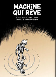
This image is the illustration of the flyleaf of Machine qui rêve / Machine which dreams (1998),the 46th volume of the famous comic strip serie Spirou and Fantasio. It is well known for being the last book of the serie realised by Tome and Janry , and for being the darkest and the more realistic one. Indeed, Machine which dreams is far away for the happy and thin atmosphere of the other ones, we can even say that it is a thriller, that is the reason why it has been so criticized.
The story is more complex than usual: Spirou, as an infiltrated reporter, pretends to be the subject of a laboratory with dubious activities. When he wakes up he is lying in the middle of the street, it’s raining.. and he is wanted! There begins a speed chase between dream and reality.
This illustration is really representative of the gloomy and dark atmosphere of the volume, and also of its psychologic dimension. In fact the main characters, seen from a low angle shot, is watching himself in a puddle… Difficult to know wich one is the true Spirou!
To me it is a wonderful image that illustrate perfectly the identity crisis lived by the protagnist; It reminds me of the book Alice through the looking glass written by Lewis Carroll because it seems like Spirou is going to enter an another world, to join his reflect on the the other side of the water. It also remembers me of the film the double (Richard Ayoade) where the main character, shy and almost invisible for the others, meets a perfect copy of himself but who has a totally different character.
Dream or reality?

Alice Marty G

Maciej Ratajski-Only You Can Understand This, 2012

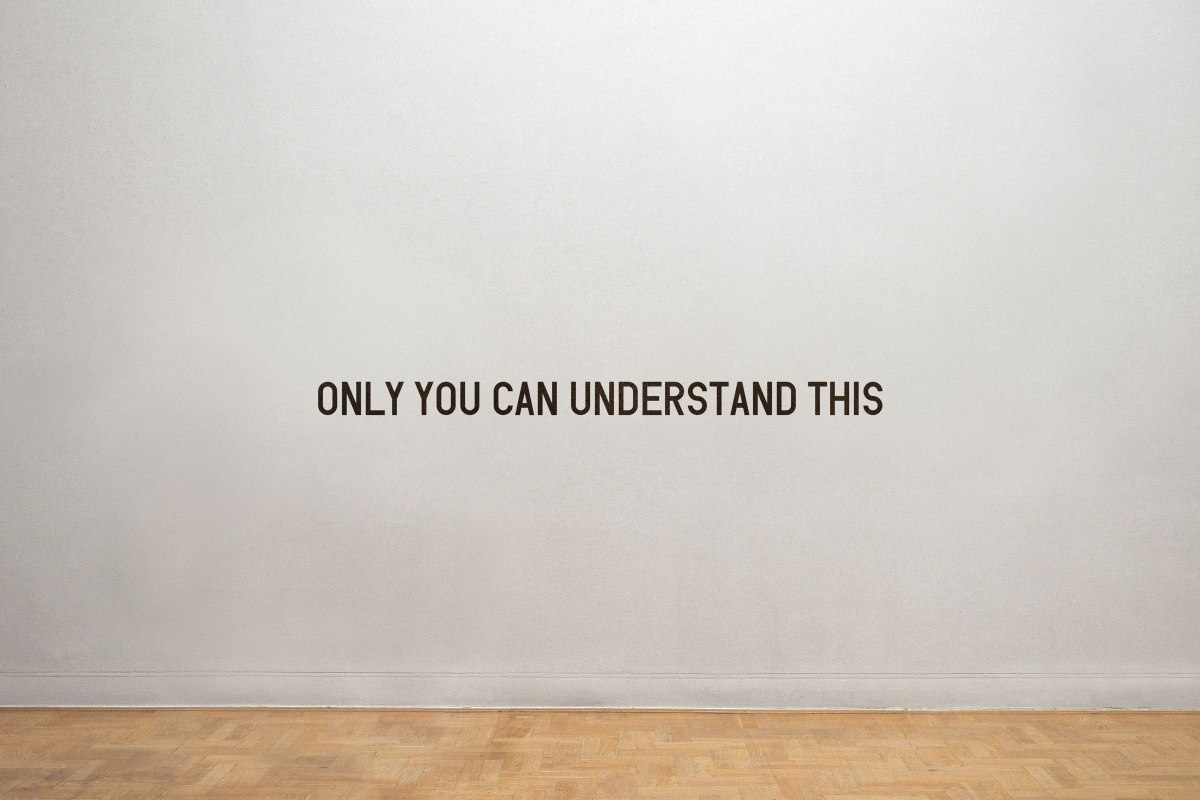
Maciej Ratajski is a russian conceptual artist whose works are known for its humor. One of his most remarkable art work is the sentence “Only You Can Understand This” written on a wall by vinyl lettering in 2012. Highly conceptual, this work is nothing more than a simple sentence. This work is one of the sentences of his series called the “Inscriptions”. Just like the photo above, all the other sentences are also presented on this wall alone.

What eventually catches our attention, of course, are the bold black vinyl letters, not big enough when compared to the huge wall, creating a tension. It’s as if those letters appeared from the wall. They are looking at us, calling us and eventually inviting us to understand “this”. But is “this” the sentence that is written above in the picture or is it something else? If “this” is simply the sentence, then this sentence is just being silly because everyone can understand its literal meaning. Therefore, if “this” refers something else than this sentence, it is clear that the artist isn’t putting great importance on what “this” is because it isn’t exactly stated what it is. It can be anything we want.

This one simple sentence written alone on this huge wall is definitely intriguing the curiosity of those who are viewing it. We are feeling uncomfortable because of this statement that affirms that we understand although we clearly don’t (at least in the first glance). Annoying, isn’t it? Must we be confused? Is this the meaning this work? We generally feel something when we see an artwork but personally, when I first read this, I didn’t know what to feel. Previously I had written that maybe there is nothing to understand, it depends on whatever we think it is. Then there is just one question left to ask. To who is this exactly speaking to?

Ratajski, in his many other works, points out the ignorant public who refuse to accept artworks if they seem to be too simple and too hard to understand such as this sentence: Only You Can Understand This. He is clearly angry with his public who mock him by asking “How is this art?” of “How can this be art?”. But we must realize that most of the people don’t really understand conceptual art. This is why in many art exhibitions, we often see people who seem to be bored, tired and annoyed. So this time, instead of being angry to his public who never seem to understand anything, Ratajski makes a perfect artwork for those who just wander around in the exhibition like a tourist: Only You Can Understand This. It’s the only artwork in which they can act like they understand. This sentence suddenly transformed them into a professional art critique. Only they can understand this. They simply need to realize the only thing they need to do is pretend they understand.

To wrap up, We can see that Ratajski is trying to communicate with his public using only words without any other decorations or illustrations. He is a conceptual artist like Robert Barry. Personally, I am in love with this phrase. I find it very amusing that it doesn’t tell us what “this” is. It also make me feel special and different from others. I believe this is a success not because I understand it but because it’s simply very amusing and… intriguing.

André An

Classe A


Bart Hess Echo

bart hess

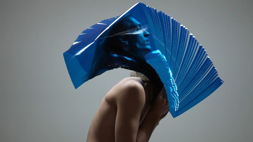
The image represents the body extension with a simple material, the plastic film. Because of this accumulation, Bart Hess cuts the time. This document is a video project which takes place in the dush national glassmuseum.

Bart Hess belongs to a futurist movement. He works with bodies and sofware in order to explore the body shapes.

I guess Bart Hess wants to denounce the fact that all these sofware are taking over the world, and consequently on our body. On the other hand, we can think that this is the man’s return to the primary state through the water element.

Bart Hess is inspired by software, creating an incredible plastic quality. However, in the video, you might think that it’s photoshop and not an actual plastic research.

Alice Cazenave, D


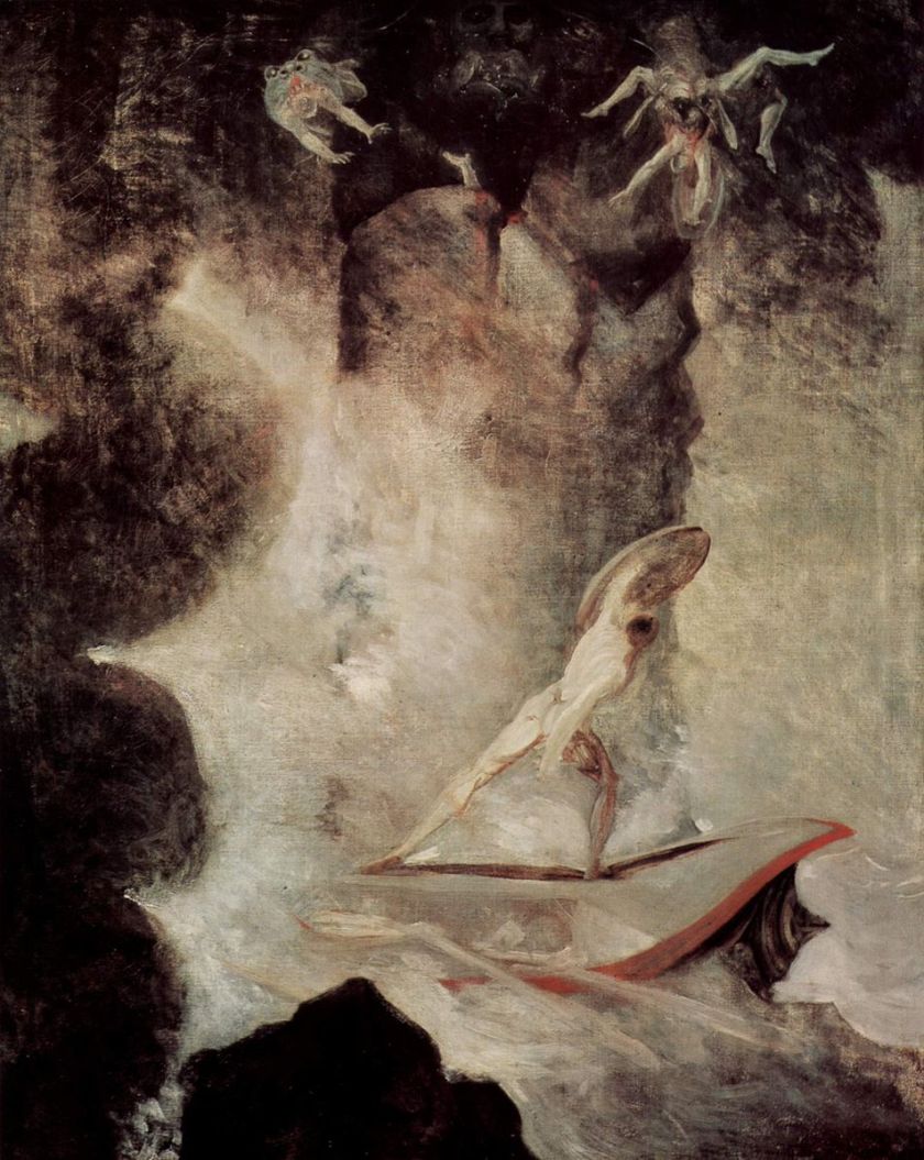
Odysseus in front of Scylla and Charybdis

Johann_Heinrich_Füssli_054

This oil painting was made by the preromantic painter Johann Heinrich Füssli between 1974 and 1976.

It represents Ulysses’ choice between Scylla and Charybdis.

Scylla and Charybdis are mythical sea monsters which were believed to guard a narrow inlet. Greeks believed that to go through, you either had to pass near Charybdis, which could swallow your whole ship, or near Scylla, which would eat the sailors it could catch with its many heads.

Trying to go back home, Ulysses (whose greek name is Odysseus), had to pass through. He chose Scylla over Charybdis, prefering to lose a few men and not wanting to risk killing his entire crew.

Ulysses is represented in the bottom half of the painting, standing on his ship, naked, wielding his shield over his head to protect himself from Scylla. We can only see two heads of the monster, both devouring Ulysses’ men alive, but its whole body is suggested in the background, and a seemingly floating hand allows us to understand that more heads are feeding, hidden in the shadows.

If the majority of the painting is white and cream, the pale monster heads stand out on a black background, at the top of the painting. On the left and bottom, there are black shapes wich could be either Chaybdis or mere rocks.

While the subject of the work itself is pretty clear and straightforward (mainly thanks to the title), the majority of the painting is foggy and nearly abstract. The unknow nature of the surrounding landscape, the boat itself being mostly hidden, makes it hard for us to figure out what’s going on. The almost exclusively black and white palette used contributes to the fearfull, oppressing atmosphere of the work. The only alive, easily identified figure is Ulysses, both standing up to confront the monster and trying to hide and protect himself from it, alone, surrounded by light but followed and threatened by darkness.

Monsters and fears were a common theme amongst preromantic painters, and so was the figure from behind, wich allows anyone to identify as the character and ”enter” into the painting.

Here, we are confronted with the unknow, and the fears that emerge from it, just like Scylla emerges from the shadows. The monster, wich may represent fears, is threatening enough for us to be affraid of it but its nature and the setting are vague enough, let’s enough place to the unknow, to let us imagine our own demons. Ulysses may represent any of us trying to overcome a fear, or exploring outside of our comfort zone, as he seems to be taking a step forward. However, he is still small, surrounded by a strange and scary world and still needs the protection of his shield, just like we may, when trying to face our own monsters.

To sum up, this painting is amazing because of its unique atmosphere and the feelings it can convey through its symbols, may it be the fear of the unknown or the first step forward made to overcome it.

Dott Julie – A

Ren Hang

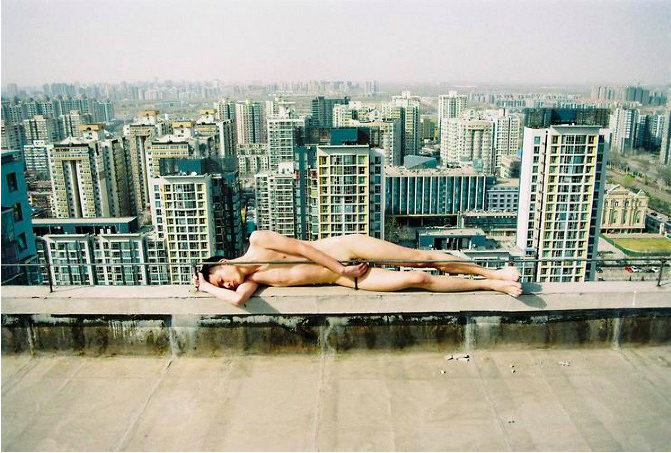
Capture%20d’écran%202013-01-23%20à%2022_58_06The Art work that I’ve chosen is a photography from Ren Hang who is a Chinese photographer.

In the foreground, we can see a naked man who is laying on the edge of a skyscraper. On the background, there are lots of other skyscrapers and we can see the horizon line of the city.
There is a very strong contrast between the landscape of the city and the naked man. Firstly, the lines of the city are very geometrical (the squares formed by the windows) and are also vertical, unlike the naked character where we can see the curves of his body, and he is positioned in a horizontal line. Secondly, the background only have cold colors (shades of blue and grey) and the man has a warm skin tone.

This photography is interesting because it shows the two main inspirations of the artist: the city activity and the Eros. In my opinion, the position of the naked man shows the risk that takes Ren Hang for taking pictures of naked people and sexual content in China. In fact, many of his artwork has been destroyed and censored by the Chinese government. I think this image represents how his works are always “on the edge” of being censored.

I love this photography because it has a very odd atmosphere. Usually when we are naked we are in the most private situations, but in this case he is in a very open place. I think this work questions the complex relation between the private and public space of the individuals who live in big cities.

Simon Mine classe B